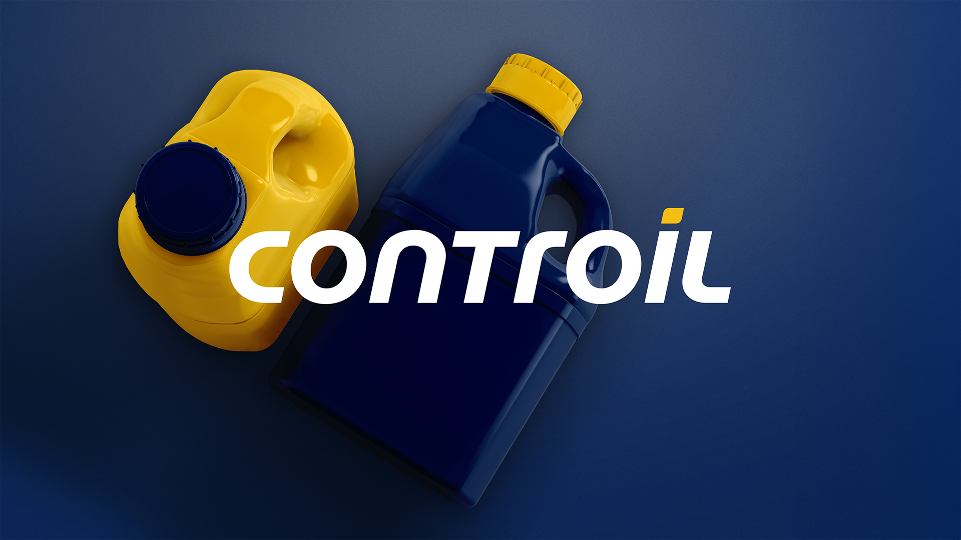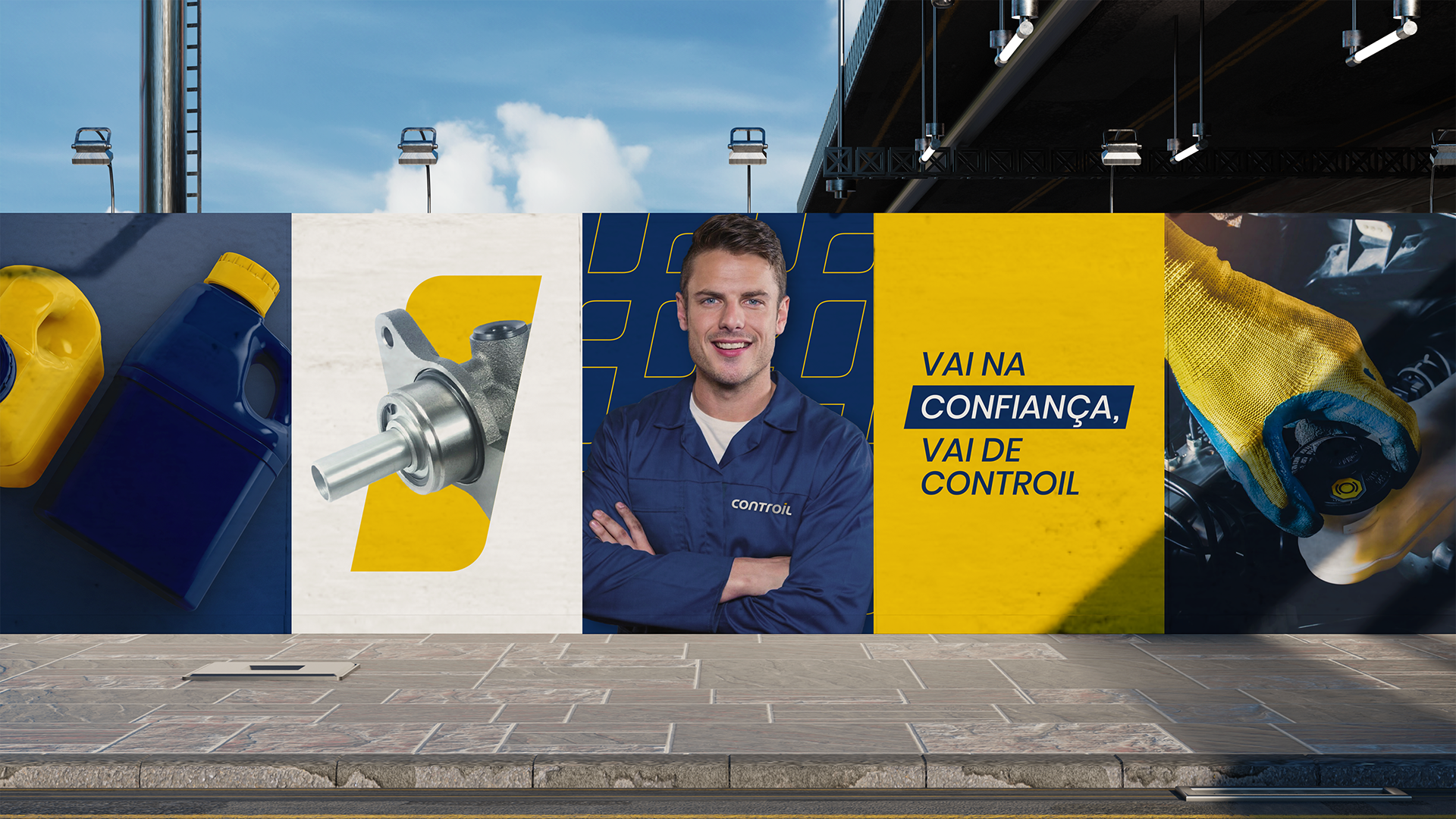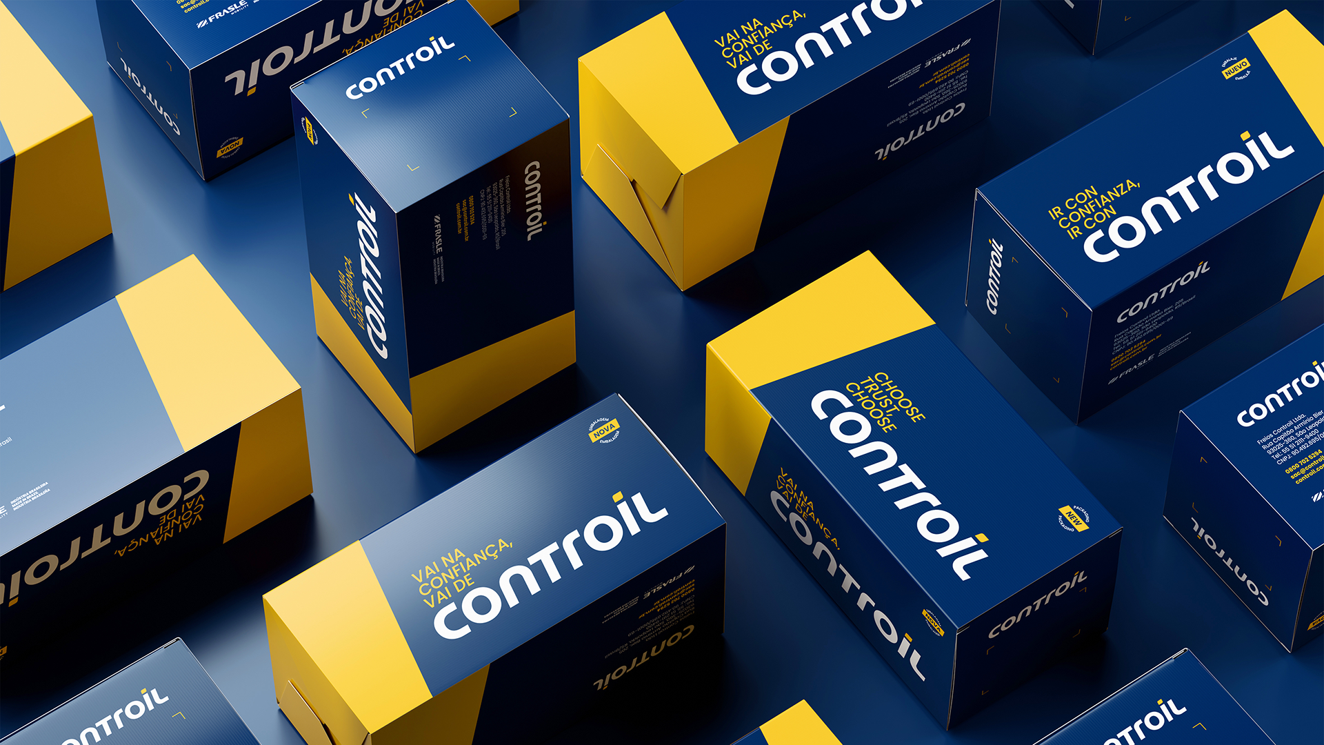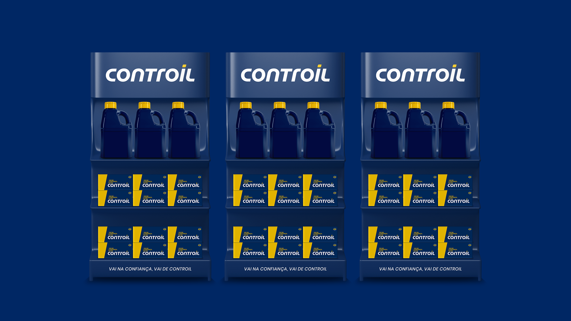

In order to reflect a moment of expansion and independence, Controil — a leading company in the hydraulic brake component replacement sector — approached us to develop and consolidate a new identity. The proposal was to move away from old elements and adequately convey both the brand’s leadership positioning and the strong bond of trust established with its audience.
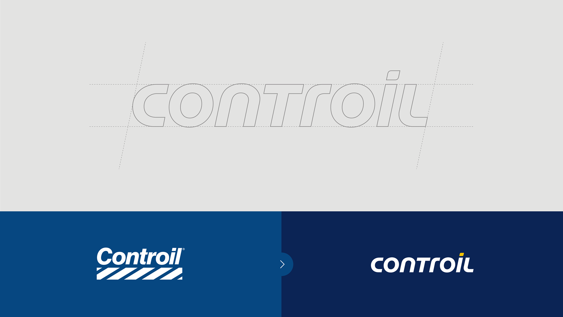
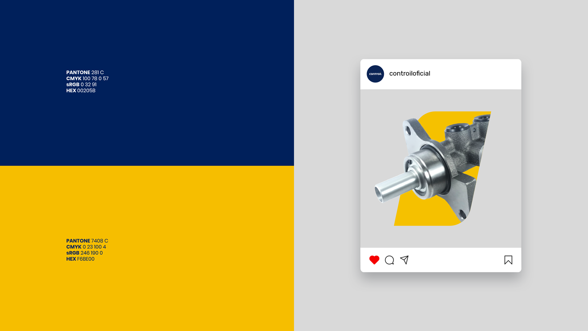
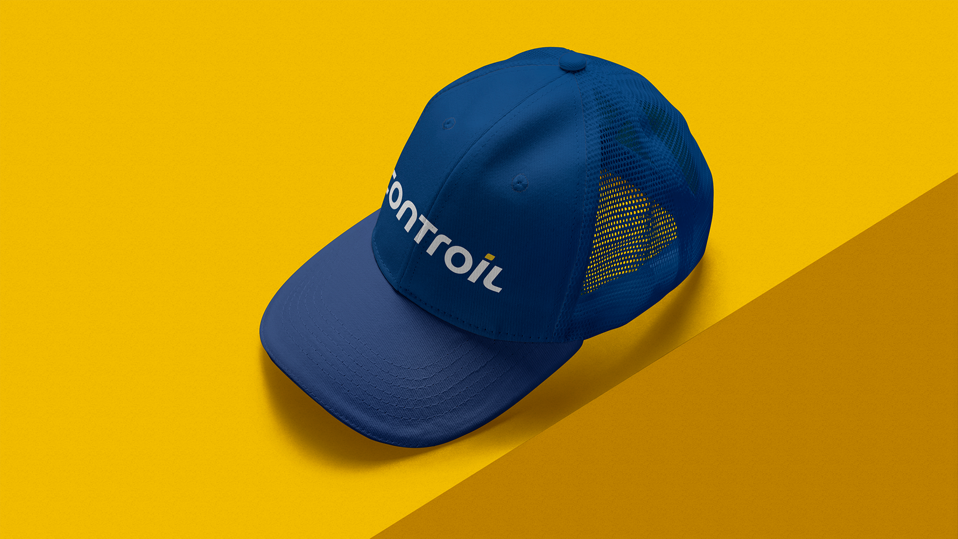
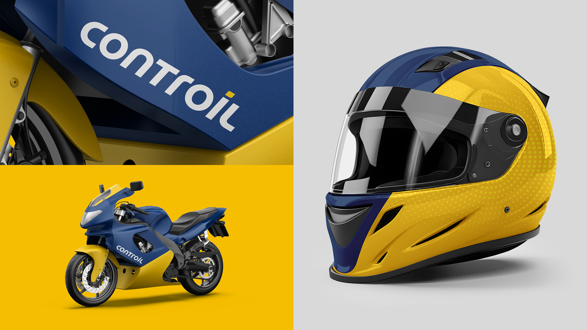
Through a new typographic design, we opted for a system of upper and lower case letters, but with similar proportions and the same visual weight, incorporating curves and rounded shapes to balance the brand’s authority with its empathy. We also added a more dynamic touch to the accent of the letter “i”, opening space for creative developments in the company’s communication. Finally, we preserved and highlighted the chromatic prominence of navy blue in combination with yellow — a duo that guarantees Controil immediate and unmistakable recognition.