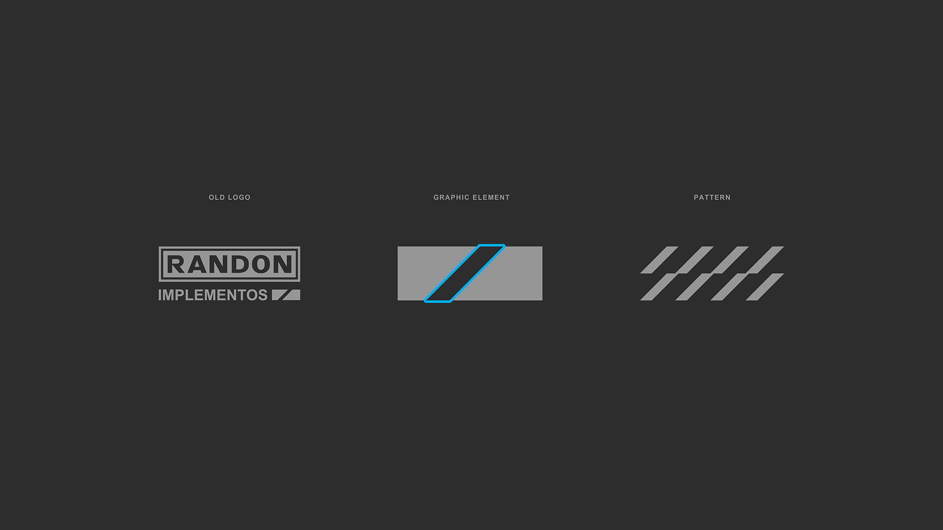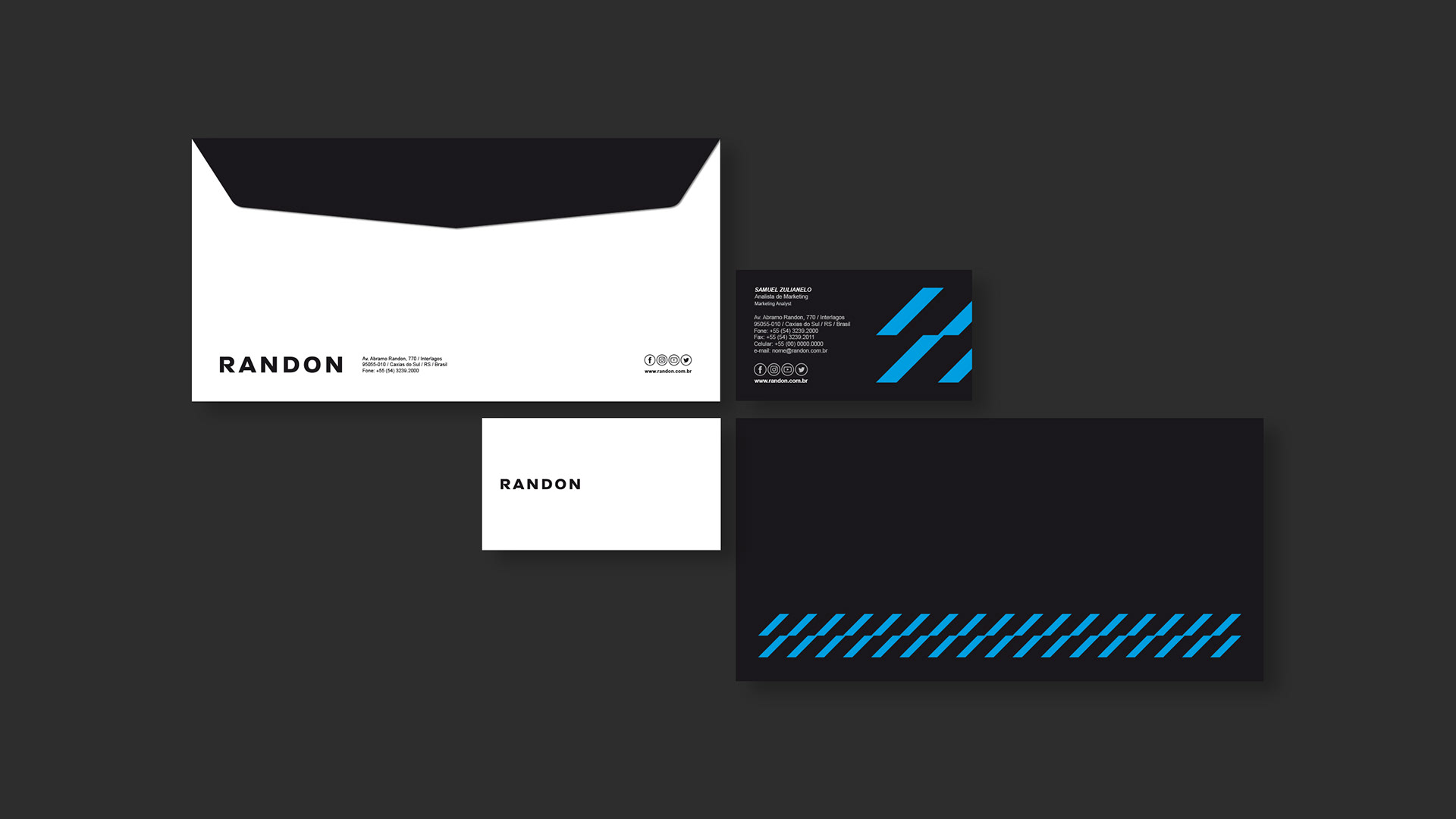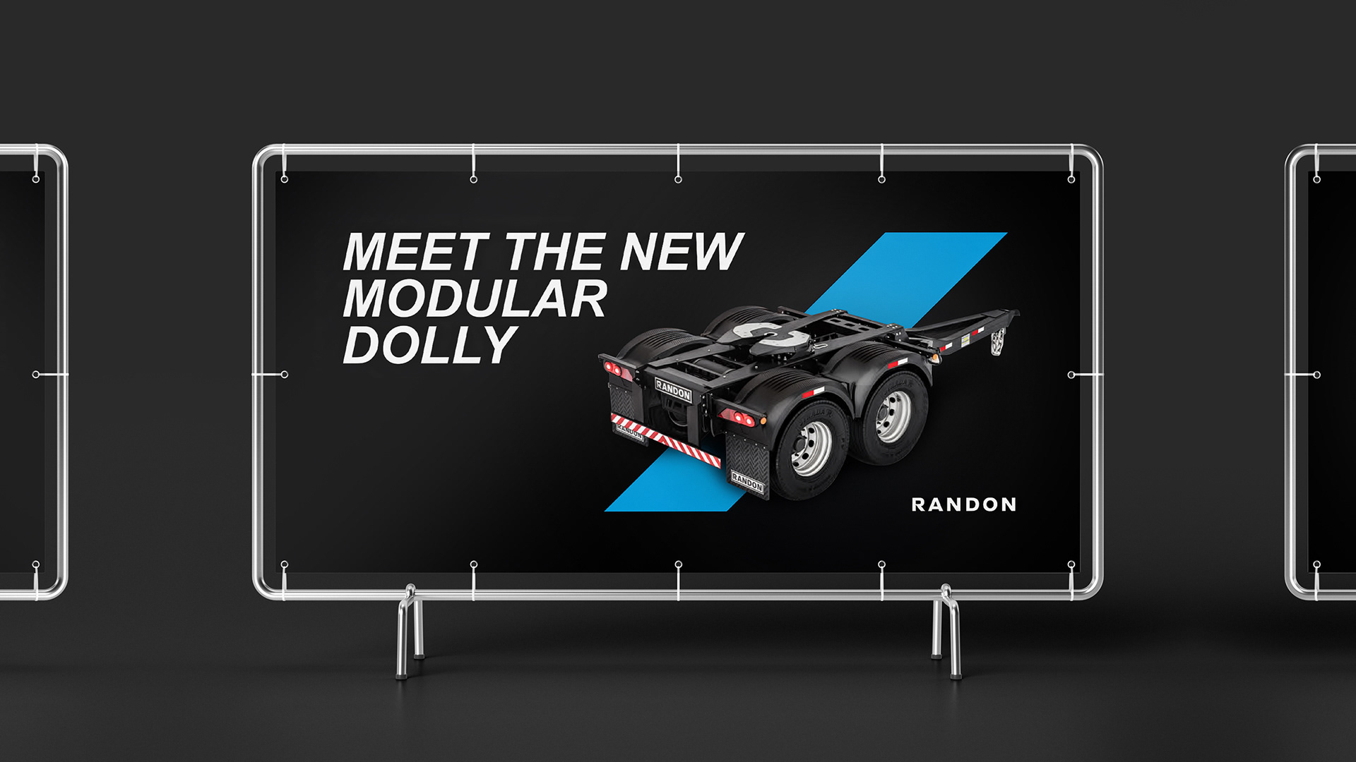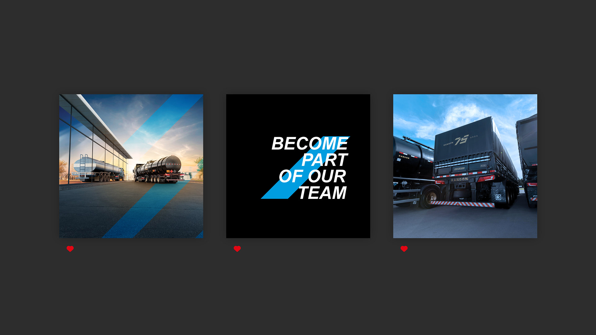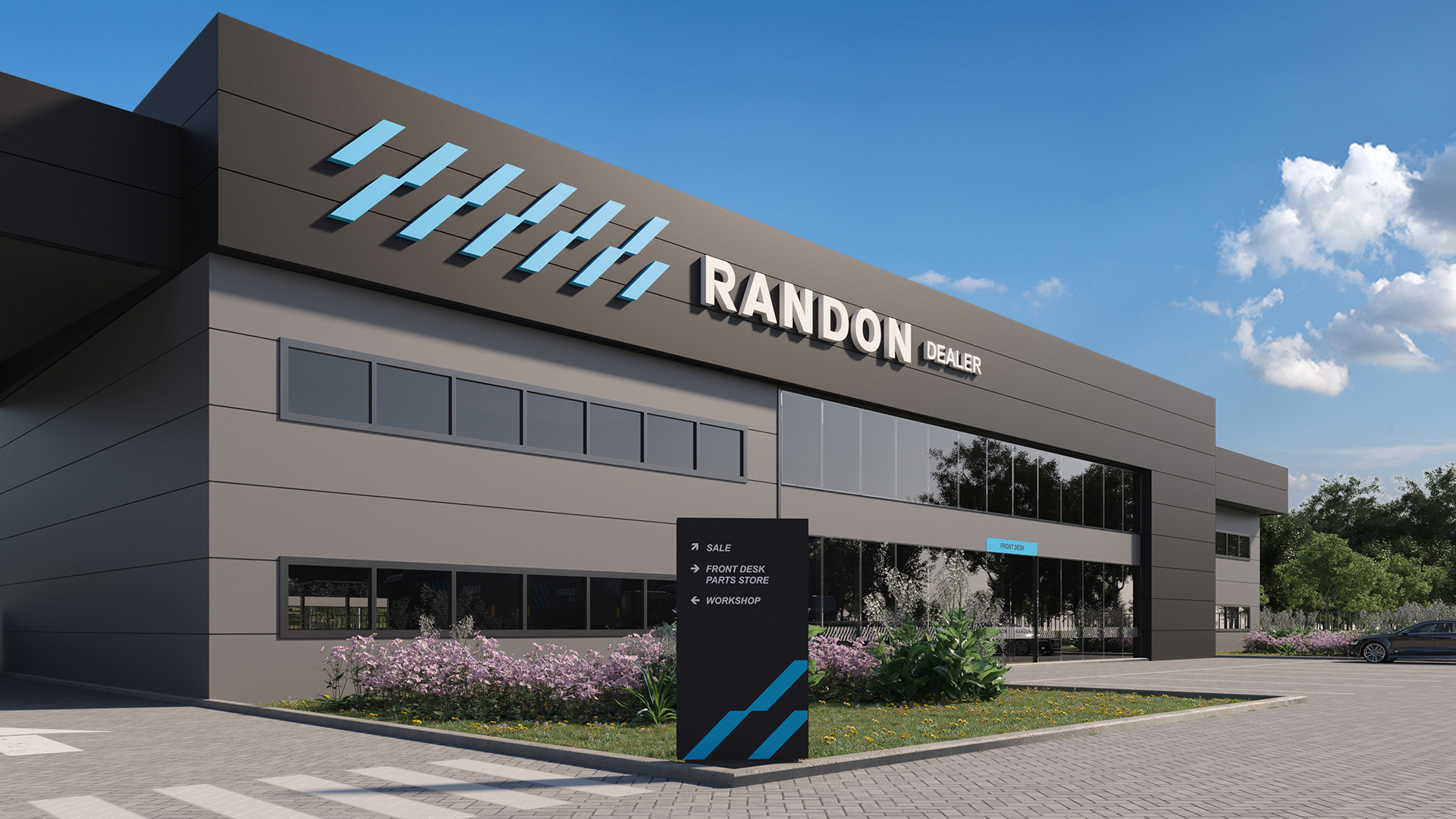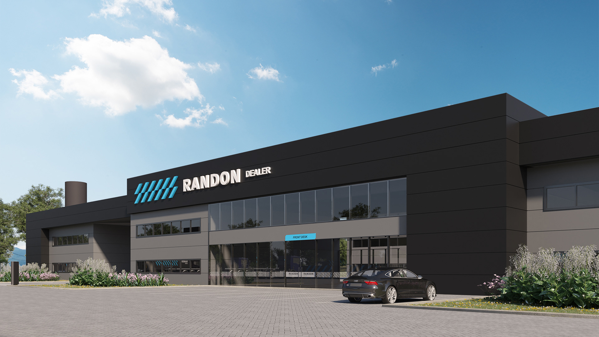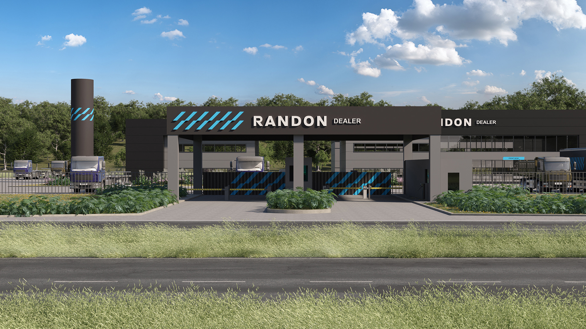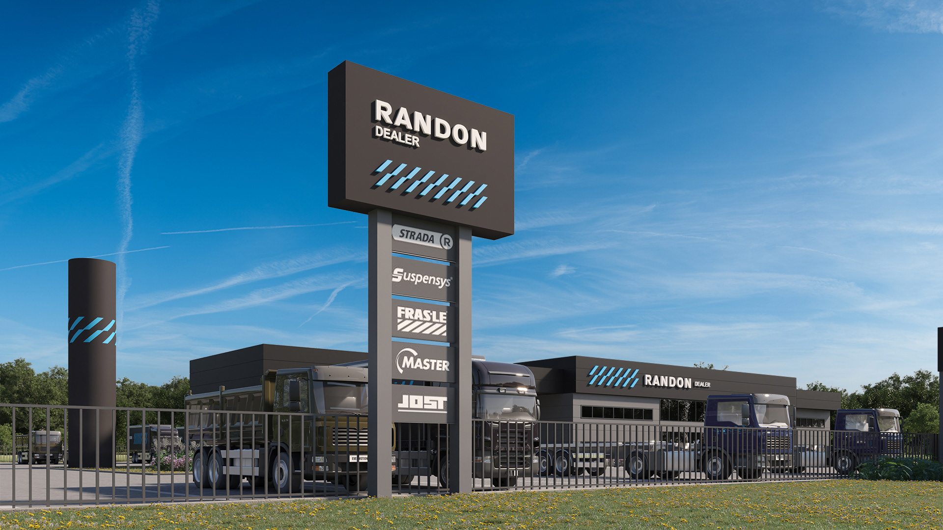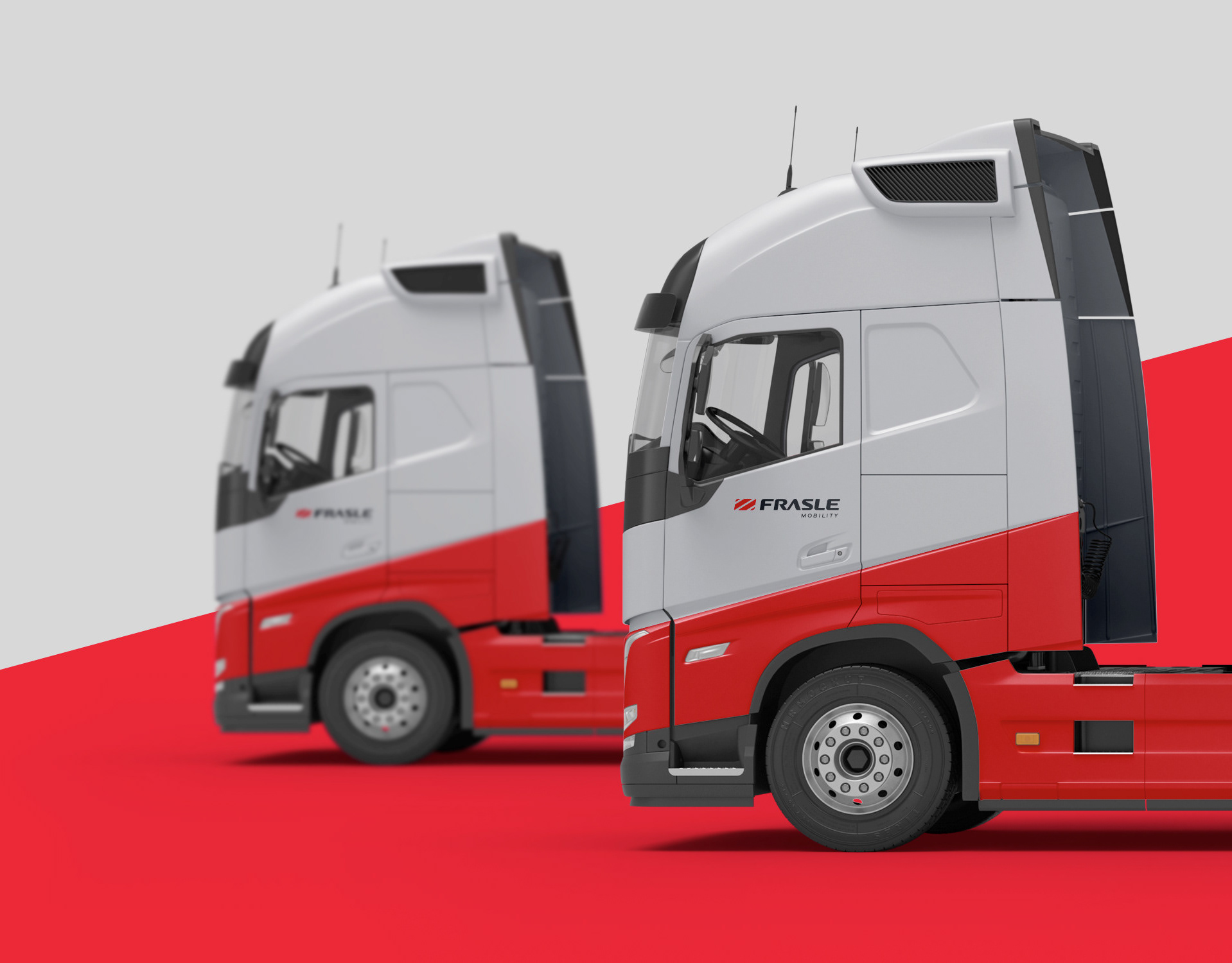
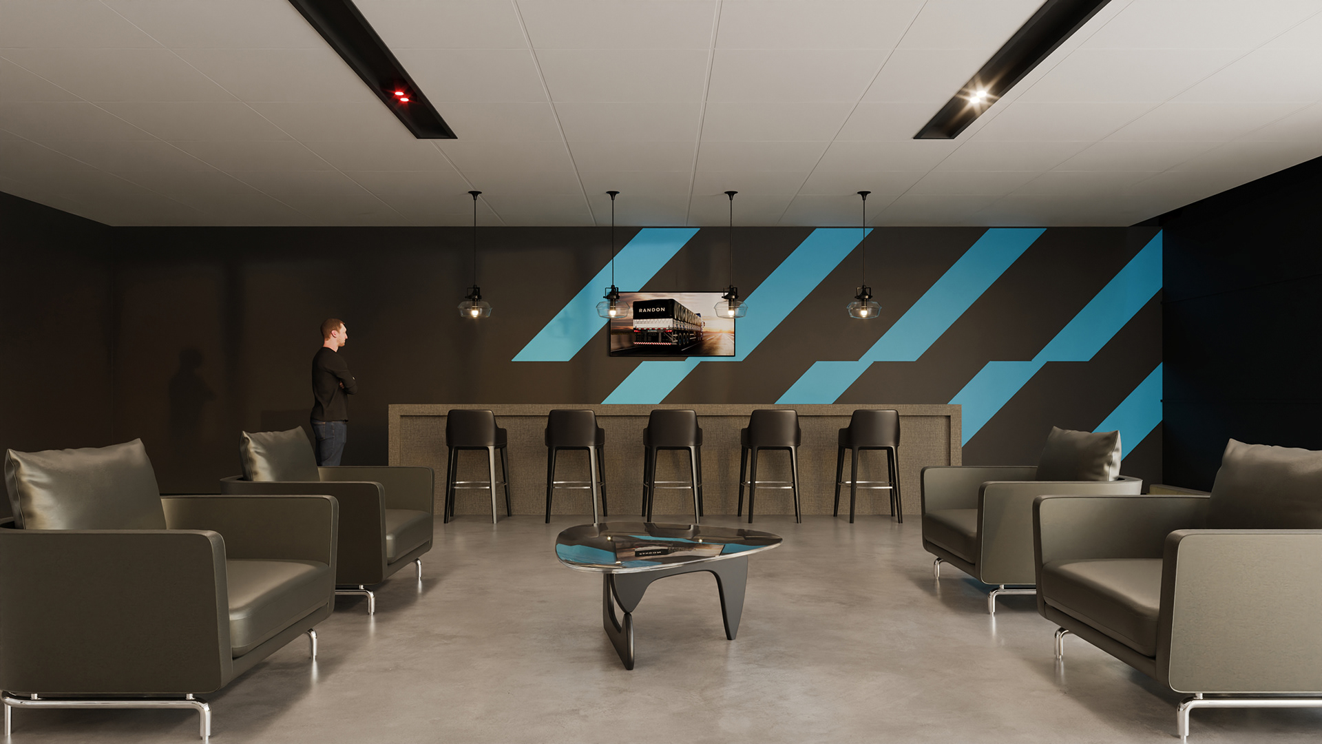
Randon is a leading global reference in cargo transportation solutions and a leader in semi-trailer manufacturing in Latin America. Despite its relevance, its communication suffered from excessive graphics and a lack of unity, hindering the identification of its true brand assets. Through a strategic review of its history, we reintroduced a proprietary, dynamic, and minimalist graphic element from the company's old logo. This not only brought consistency to the touchpoints but also strengthened the brand's personality and enhanced its legacy. The project was complemented by a review of colors, typography, and iconography, consolidating a cohesive, contemporary visual ecosystem aligned with Randon's positioning.